MACROMEDIA FLEX 2 - CREATING AND EXTENDING COMPONENTS Manual
Summary of FLEX 2 - CREATING AND EXTENDING COMPONENTS
Page 1
Creating and extending fl ex 2 components ad ob e ® fl e x ™ 2.
Page 2
© 2006 adobe systems incorporated. All rights reserved. Creating and extending flex™ 2 components if this guide is distributed with software that includes an end-user agreement, this guide, as well as the software described in it, is furnished under license and may be used or copied only in accordan...
Page 3
3 contents chapter 1: about flex documentation . . . . . . . . . . . . . . . . . . . . . . . 7 part 1: creating custom flex components chapter 2: creating flex components . . . . . . . . . . . . . . . . . . . . . . 13 about creating components. . . . . . . . . . . . . . . . . . . . . . . . . . . . ....
Page 4
4 contents chapter 8: creating advanced mxml components . . . . . . . . . . 91 about reusable mxml components . . . . . . . . . . . . . . . . . . . . . . . . . . . . . 91 adding custom properties and methods to a component . . . . . . . . . . 92 working with events . . . . . . . . . . . . . . . . . ...
Page 5
Contents 5 chapter 14: creating custom validators . . . . . . . . . . . . . . . . . . . 217 validating data by using custom validators. . . . . . . . . . . . . . . . . . . . . . . 217 example: creating a simple validator . . . . . . . . . . . . . . . . . . . . . . . . . . . .219 example: validating ...
Page 6
6 contents.
Page 7
7 1 chapter 1 about flex documentation creating and extending flex 2 components describes how to create components in mxml and actionscript. This manual is intended for component developers who are developing new components for use in their adobe® flex™ application. Contents using this manual . . . ...
Page 8
8 about flex documentation accessing the flex documentation the flex documentation is designed to provide support for the complete spectrum of participants. Documentation set the flex documentation set includes the following titles: viewing online documentation all flex documentation is available on...
Page 9
Typographical conventions 9 typographical conventions the following typographical conventions are used in this book: ■ italic font indicates a value that should be replaced (for example, in a folder path). ■ code font indicates code. ■ code font italic indicates a parameter. ■ boldface font indicate...
Page 10
10 about flex documentation.
Page 11
11 1 part 1 creating custom flex components this part contains an introduction to creating custom adobe flex components. The following topics are included: chapter 2: creating flex components . . . . . . . . . . . . . . . . . . . . . . . 13 chapter 3: using actionscript to create components . . . . ...
Page 13
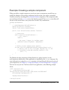
13 2 chapter 2 creating flex components adobe flex supports a component-based development model. You use the predefined components included with flex to build your applications, and create components for your specific application requirements. You can create components using mxml or actionscript. De...
Page 14
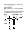
14 creating flex components a common coding practice is to divide an application into functional units, or modules, where each module performs a discrete task. Dividing your application into modules provides you with many benefits, including the following: ease of development different developers or...
Page 15
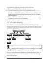
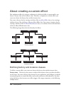
About creating components 15 this example shows the following relationships among the components: ■ you define a main mxml file that contains the tag. ■ in your main mxml file, you define an actionscript block that uses the tag. Inside the actionscript block, you write actionscript code, or include ...
Page 16
16 creating flex components customizing existing flex components one reason for you to create a component is to customize an existing flex component for your application requirements. This customization could be as simple as setting the label property of a button control to submit to create a custom...
Page 17
About creating components 17 the following example shows two components based on the flex button component, one defined in actionscript and the other in mxml: both implementations create a component as a subclass of the button class and, therefore, inherit all of the public and protected properties,...
Page 18
18 creating flex components some basic guidelines include the following: ■ mxml components and actionscript components both define new actionscript classes. ■ almost anything that you can do in a custom actionscript custom component, you can also do in a custom mxml component. However, for simple co...
Page 19
Creating custom components 19 creating custom components you create custom components as either mxml or actionscript files. This section contains an overview of both methods. Creating mxml components flex supplies a combobox control that you can use as part of a form that collects address informatio...
Page 20
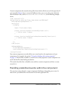
20 creating flex components the main application, or any other mxml component file, references the statecombobox component, as the following example shows: the mxml tag name for a custom component is composed of two parts: the namespace prefix, in this case mycomp , and the tag name. The namespace p...
Page 21
Creating custom components 21 the statecombobox.Mxml file specifies the combobox control as its root tag, so you can reference all of the properties of the combobox control in the mxml tag of your custom component, or in the actionscript specified in an tag. For example, the following example specif...
Page 22
22 creating flex components for example, you can define a custom button component based on the flex button class, as the following example shows: package mycomponents { // intro/mycomponents/mybutton.As import mx.Controls.Button; public class mybutton extends button { // define the constructor. Publ...
Page 23
Where to go from here 23 deploying components when you deploy your custom components as mxml or actionscript files, you typically deploy them in the same directory structure as your application files, in a directory specified in the actionscript classpath, or for flex data services, in the web-inf/f...
Page 24
24 creating flex components.
Page 25
25 3 chapter 3 using actionscript to create components you use actionscript code to create actionscript components for adobe flex, or to add logic to mxml components. Actionscript provides flow control and object manipulation features that are not available in mxml. This topic contains a summary of ...
Page 26
26 using actionscript to create components your package statement must wrap the entire class definition. If you write your actionscript class file to the same directory as your other application files, you can leave the package name blank. However, as a best practice, you should store your component...
Page 27
Using actionscript 27 you then specify the namespace definition for the component, as the following example shows: xmlns:mycomp="myformatters.Dataformatters.*"> ... Xmlns:mycomp="myformatters.Dataformatters.*"> ... Using the import statement you use the import statement to import any classes that yo...
Page 28
28 using actionscript to create components using the class statement you use the class statement to define your class name, and to specify its superclass, as the following example shows: package mycomponents { // import necessary classes import mx.Core.Container; import mx.Controls.Button; // import...
Page 29
Using actionscript 29 you call the super() method within your constructor to invoke the superclass’s constructor to initialize the inherited items from the superclass. The super() method should be the first statement in your constructor; otherwise, the inherited parts of the superclass might not be ...
Page 30
30 using actionscript to create components defining properties as variables properties let you define data storage within your class. You can define your properties as public, which means that they can be accessed by users of the class. You can also define properties as private, which means that the...
Page 31
Using actionscript 31 to define getter and setter methods, precede the method name with the keyword get or set , followed by a space and the property name. The following example shows the declaration of a public property named initialcount , and the getter and setter methods that get and set the val...
Page 32
32 using actionscript to create components defining methods methods define the operations that your class can perform. You define methods in the body of the class. Your methods can override a method of a superclass, or define new functionality for your components. If the method adds new functionalit...
Page 33
Using actionscript 33 flex creates an array called rest for the optional arguments. Therefore, you can determine the number of arguments passed to the method by using rest.Length , and access the arguments by using rest[i] . Using the super keyword in a method override you use the super keyword in a...
Page 34
34 using actionscript to create components about scope scoping is mostly a description of what the this keyword refers to at any given point in your application. In the main mxml application file, the file that contains the tag, the current scope is the application object and, therefore, the this ke...
Page 35
35 4 chapter 4 creating custom events you can create custom events as part of defining mxml and actionscript components. Custom events let you add functionality to your custom components to respond to user interactions, to trigger actions by your custom component, and to take advantage of data bindi...
Page 36
36 creating custom events custom components that extend existing flex classes inherit all the events of the base class. Therefore, if you extend the button class to create the mybutton class, you can use the click event, and the events that all controls inherit, such as mouseover or initialize , as ...
Page 37
About events 37 using an event object when a flex component dispatches an event, it creates an event object, where the properties of the event object contain information describing the event. An event listener takes this event object as an argument and accesses the properties of the object to determ...
Page 38
38 creating custom events dispatching custom events flex defines many of the most common events, such as the click event for the button control, however, your application may require that you create events. In your custom flex components, you can dispatch any of the predefined events inherited by th...
Page 39
Dispatching custom events 39 suppose that you want to pass information about the state of your component to the event listener as part of the event object. To do so, you create a subclass of the event class to create an event, enablechangeevent, as the following example shows: package myevents { //e...
Page 40
40 creating custom events using the event metadata tag you use the [event] metadata tag to define events dispatched by a component so that the flex compiler can recognize them as mxml tag attributes in an mxml file. You add the [event] metadata tag in one of the following locations: actionscript com...
Page 41
Dispatching custom events 41 once defined using the [event] metadata tag, you can refer to the event in an mxml file, as the following example shows: xmlns:mycomp="mycomponents.*" > import myevents.Enablechangeevent; public function enablechangedlistener(eventobj:enablechangeevent):void { // handle ...
Page 42
42 creating custom events eventobj.Isenabled=true; dispatchevent(eventobj); for complete examples that create and dispatch custom events, see chapter 8, “creating advanced mxml components,” on page 91 and chapter 9, “creating simple visual components in actionscript,” on page 121 . Creating static c...
Page 43
Dispatching custom events 43 you can use this technique when you define your event classes. The following example modifies the definition of the enablechangeeventconst class to include a static constant for the type property: package myevents { //events/myevents/enablechangeeventconst.As import flas...
Page 44
44 creating custom events now you create an instance of the class by using the static constant, as the following example shows for the mybuttonconst custom component: click="dispatchevent(new enablechangeeventconst(enablechangeeventconst.Enable_changed));"> import myevents.Enablechangeeventconst; ]]...
Page 45
45 5 chapter 5 using metadata tags in custom components you insert metadata tags into your mxml and actionscript files to provide information to the flex compiler. Metadata tags do not get compiled into executable code, but provide information to control how portions of your code get compiled. This ...
Page 46
46 using metadata tags in custom components about metadata tags metadata tags provide information to the flex compiler that describe how your components are used in a flex application. For example, you might create a component that defines a new event. To make that event known to the flex compiler s...
Page 47
About metadata tags 47 using metadata tags the flex compiler recognizes component metadata statements in your actionscript class files and mxml files. The metadata tags define component attributes, data binding properties, events, and other properties of the component. Flex interprets these statemen...
Page 48
48 using metadata tags in custom components in this example, you add the [event] metadata tag before the class definition to indicate that the class dispatches an event named enablechanged . You also include the [inspectable] metadata tag to indicate that the enableta property is accessible in flex ...
Page 49
Metadata tags 49 metadata tags the following table describes the metadata tags that you can use in actionscript class files: tag description [arrayelementtype] defines the allowed data type of each element of an array. For more information, see “arrayelementtype metadata tag” on page 50 . [bindable]...
Page 50
50 using metadata tags in custom components the following sections describe the component metadata tags in more detail. Arrayelementtype metadata tag when you define an array variable in actionscript, you specify array as the data type of the variable. However, you cannot specify the data type of th...
Page 51
Metadata tags 51 the following table describes the property of the [ arrayelementtype] metadata tag: bindable metadata tag when a property is the source of a data binding expression, flex automatically copies the value of the source property to any destination property when the source property chang...
Page 52
52 using metadata tags in custom components ■ before a public, protected, or private property defined as a variable to make that specific property support binding. The tag can have the following forms: [bindable] public var foo; the flex compiler automatically generates an event named propertychange...
Page 53
Metadata tags 53 you can specify the event name, as the following example shows: [bindable(event="changeshortnames")] public function set shortnames(val:boolean):void { ... // create and dispatch event. Dispatchevent(new event("changeshortnames")); } // get method. Public function get shortnames():b...
Page 54
54 using metadata tags in custom components in this example, the setter updates the value of the property, and then creates and dispatches an event to invoke an update of the destination of the data binding. In an mxml file, you can make all public properties that you defined as variables usable as ...
Page 55
Metadata tags 55 the following example uses a static constant as the source for a data-binding expression: // this syntax casues a compiler error. // [bindable] // public static var varstring:string="a static var."; public static const conststring:string="a static const."; ]]> defaultproperty metada...
Page 56
56 using metadata tags in custom components you insert the [effect] metadata tag before the class definition in an actionscript file, or in the block in an mxml file. The [effect] metadata tag has the following syntax: [effect(name="eventnameeffect", event="eventname")] the following table describes...
Page 57
Metadata tags 57 the following table describes the properties of the [ event] metadata tag: the following example identifies the myclickevent event as an event that the component can dispatch: [event(name="myclickevent", type="flash.Events.Event")] if you do not identify an event in the class file w...
Page 58
58 using metadata tags in custom components the [iconfile] metadata tag has the following syntax: [iconfile("filename")] the filename property specifies a png, gif, or jpeg file that contains the icon, as the following example shows: [iconfile("mybutton.Png")] public class mybutton extends button { ...
Page 59
Metadata tags 59 the following table describes the properties of the [ inspectable] metadata tag: property type description category string groups the property into a specific subcategory in the property inspector of the flex builder user interface. The default category is "other" . Defaultvalue str...
Page 60
60 using metadata tags in custom components the following example defines the myprop parameter as inspectable: [inspectable(defaultvalue=true, verbose=1, category="other")] public var myprop:boolean; instancetype metadata tag the [instancetype] metadata tag specifies the allowed data type of a prope...
Page 61
Metadata tags 61 you insert the [noncommittingchangeevent] metadata tag before an actionscript property definition or before a setter or getter method. The [noncommittingchangeevent] metadata tag has the following syntax: [noncommittingchangeevent("event_name")] in the following example, the compone...
Page 62
62 using metadata tags in custom components the following example shows the definition of the textselectedcolor style property: [style(name="textselectedcolor",type="number",format="color",inherit="yes")] the next example shows the definition of the verticalalign style property: [style(name="vertica...
Page 63
63 6 chapter 6 compiling components when you compile an application, you create a swf file that a user can download and play. You can also compile any custom components that you create as part of the application. When you create a component, you save it to a location that the flex compiler can acces...
Page 64
64 compiling components flex component file types when you create a flex component, you can distribute it in one of several different file formats, as the following table shows: you must take into consideration the file format and file location when you compile an application that uses the component...
Page 65
About compiling 65 the default option is the target file to compile into a swf file, and it is required to have a value. If you use a space-separated list as part of the options, you can terminate the list with a double hyphen before adding the target file; for example: $ mxmlc -option arg1 arg2 arg...
Page 66
66 compiling components ■ an actionscript component in a subdirectory of the main application directory must define a fully qualified package name that is relative to the location of the application’s root directory. For example, if you define a custom component in the dir1/dir2/mycontrols/piechart....
Page 67
Compiling components with flex 2 sdk 67 for example, you can create a component for use by a single application. In that case, you store it in the directory structure of the application, usually in a subdirectory under the directory that contains the main file of the application. The component is th...
Page 68
68 compiling components distributing components as rsls one way to reduce the size of your application’s swf file is by externalizing shared assets into stand-alone files that can be separately downloaded and cached on the client. These shared assets are loaded by any number of applications at run t...
Page 69
Compiling components with flex 2 sdk 69 distributing a component as an actionscript file when you distribute a component defined as an actionscript file, you can store it within the same directory structure as your application files, or in a directory specified in the actionscript classpath. The mxm...
Page 70
70 compiling components import mx.Formatters.Formatter public class mysimpleformatter extends formatter { ... } } in this example, the mysimpleformatter.As file is located in the mycomponents/formatter subdirectory of the main application directory. You map the mycomponents.Formatters namespace to t...
Page 71
Compiling components with flex 2 sdk 71 distributing a component as a swc file to create a swc file, use the compc utility in the flex_install_dir/bin directory. The compc utility generates a swc file from mxml component source files and/or actionscript component source files. In this example, you c...
Page 72
72 compiling components when you distribute swc files, ensure that the corresponding actionscript file is not in the directory structure of the application or in the actionscript classpath. Otherwise, flex might use the actionscript file, rather than the swc file. When you use mxmlc to compile the m...
Page 73
Compiling components with flex data services 73 distributing components as mxml and actionscript files you can deploy your components as mxml and actionscript files by copying them to the /web-inf/flex/user_classes directory, or to a directory included in the actionscript classpath. You set the acti...
Page 74
74 compiling components.
Page 75
75 2 part 2 creating mxml components this part describes how to create custom flex components in mxml. The following topics are included: chapter 7: creating simple mxml components . . . . . . . . . . . . . . 77 chapter 8: creating advanced mxml components . . . . . . . . . . . 91.
Page 77
77 7 chapter 7 creating simple mxml components adobe flex applications typically consist of multiple mxml and actionscript files, and each mxml file is a separate mxml component. Mxml components let you encapsulate functionality in a reusable component, extend an existing flex component by adding ne...
Page 78
78 creating simple mxml components for example, flex supplies a combobox control that you can use as part of a form that collects address information from a customer. You can use a combobox to let the user select the state portion of the address from a list of the 50 states in the u.S. In an applica...
Page 79
About mxml components 79 the main application, or any other mxml component file, references the statecombobox component, as the following example shows: xmlns:mycomp="*"> xmlns:mycomp="*"> in this example, the main application file includes a new namespace definition of xmlns:mycomp="*" as part of t...
Page 80
80 creating simple mxml components the statecombobox.Mxmlfile specifies the combobox control as its root tag, so you can reference all of the properties of the combobox control within the mxml tag of your custom component, or in the actionscript specified within an tag. For example, the following ex...
Page 81
About mxml components 81 creating composite mxml components a composite mxml component is a component that contains multiple component definitions within it. To create a composite component, you specify a container as its root tag, and then add flex components as children of the container. For examp...
Page 82
82 creating simple mxml components if you include child tags of the root container tag in an mxml component file, you cannot add child tags when you use the component as a custom tag in another mxml file. If you define an empty container in an mxml file, you can add child tags when you use the compo...
Page 83
Scoping in custom components 83 for example, the following example sets the horizontalpagescrollsize property and a listener for the scroll event for your custom control, but you cannot specify properties for the child checkbox or textinput controls of the form container: xmlns:mycomp="*"> import mx...
Page 84
84 creating simple mxml components the root tag of an mxml component cannot contain an id property. Therefore, if you refer to the object defined by the root tag in the body of the component, you must use the this keyword, as the following example shows: close="handlecloseevent(event);"> import flas...
Page 85
Applying styles to your custom component 85 alternatively, you might develop a component that you want to deploy with a built-in look so that it is not necessary for application developers to apply any additional styles to it. This type of component might be useful for applications that require a he...
Page 86
86 creating simple mxml components alternatively, you can define these styles by using a class selector style declaration, as the following example shows: stylename="mycbstyle"> .Mycbstyle { openduration : 1000; fontsize : 15; } ak al stylename="mycbstyle"> .Mycbstyle { openduration : 1000; fontsize...
Page 87
Applying styles to your custom component 87 ■ class selectors ■ type selectors the styles that application developers can apply correspond to the styles supported by the root tag of the mxml component. The following example uses a tag property to set a style for the custom mxml component: xmlns:myco...
Page 88
88 creating simple mxml components you can also use a type selector to define styles. A type selector applies styles to all instances of a component, as the following example shows: xmlns:mycomp="mycomponents.*"> statecomboboxwithstyleprops { openduration : 1000; } xmlns:mycomp="mycomponents.*"> sta...
Page 89
Applying styles to your custom component 89 applying a type selector to the root tag of a custom component all custom components contain a root tag that specifies the superclass of the component. In the case of statecombobox.Mxml, the root tag is . If you define a type selector for the combobox cont...
Page 90
90 creating simple mxml components if you define a type selector for a superclass of the custom control, and for the custom control itself, flex ignores any conflicting settings from the type selector for the superclass, as the following example shows: xmlns:mycomp="mycomponents.*"> combobox { color...
Page 91
91 8 chapter 8 creating advanced mxml components one of the common goals when you create mxml components is to create configurable and reusable components. For example, you might want to create mxml components that take properties, dispatch events, define new style properties, have custom skins, or ...
Page 92
92 creating advanced mxml components with loosely coupled components, you typically define properties of the component to pass information to it. These properties, defined by using variables or setter and getter methods, specify the data type of the parameter value. For more information about defini...
Page 93
Adding custom properties and methods to a component 93 defining properties and methods in actionscript with actionscript, you define properties and methods by using the same syntax that you use in an actionscript class. For more information on using actionscript to define properties and methods, see...
Page 94
94 creating advanced mxml components the following mxml application file uses the tag to configure the control to display long state names: xmlns:mycomp="mycomponents.*"> xmlns:mycomp="mycomponents.*"> the following example modifies the component to add a method that lets you change the display of t...
Page 95
Adding custom properties and methods to a component 95 you might use this new method with the click event of a button control to change the display from long names to short names, as the following example shows: xmlns:mycomp="mycomponents.*"> xmlns:mycomp="mycomponents.*"> defining properties in mxm...
Page 96
96 creating advanced mxml components the following example modifies the example in “defining properties and methods in actionscript” on page 93 to define the shortnames property by using an mxml tag, rather than an actionscript variable definition: creationcomplete="setnamelength();"> true // define...
Page 97
Adding custom properties and methods to a component 97 for more information, see chapter 3, “using actionscript to create components,” on page 25 . In the following example, the statecomboboxgetset.Mxml component contains several new properties and methods: // define private variables. Private var s...
Page 98
98 creating advanced mxml components you can also define events to be dispatched when a property changes. This enables you to signal the change so that an event listener can recognize the change. For more information on events, see “working with events” on page 107 . You can call a component’s custo...
Page 99
Adding custom properties and methods to a component 99 supporting data binding in custom properties the flex data binding mechanism provides a syntax for automatically copying the value of a property of one object to a property of another object at run time. The following example shows a text contro...
Page 100
100 creating advanced mxml components when a property is the source of a data binding expression, any changes to the property must signal an update to the destination property. The way to signal that change is to dispatch an event, as the following example shows: import flash.Events.Event; private v...
Page 101
Adding custom properties and methods to a component 101 if you omit the event name specification from the [bindable] metadata tag, flex automatically generates and dispatches an event named propertychange . If the property value remains the same on a write, flex does not dispatch the event or update...
Page 102
102 creating advanced mxml components you can also use the parentdocument property to reference the next object up in the document chain of a flex application. The parentdocument property is inherited by all components from the uicomponent class. For an mxml component, the parentdocument property re...
Page 103
Adding custom properties and methods to a component 103 the simplest way to write statecomboboxdirectref.Mxml is to use the mx.Core.Application.Application static property to write the index directly to the textarea control, as the following example shows: close="handlecloseevent(event);"> import fl...
Page 104
104 creating advanced mxml components you could make the custom component slightly more reusable by using the parentdocument property to reference the textarea control, rather than the mx.Core.Application.Application static property. By using the parentdocument property, you can call the custom comp...
Page 105
Adding custom properties and methods to a component 105 passing a reference to the component a loosely coupled component is a highly reusable component that you can easily use in different places in one application, or in different applications. To make the component from “supporting data binding in...
Page 106
106 creating advanced mxml components passing a reference to the calling component in “passing a reference to the component” on page 105 , you passed a reference to a single component to the custom mxml component. This allowed the mxml component to access only a single component in the main applicat...
Page 107
Working with events 107 remember, an mxml component corresponds to an actionscript class, where the actionscript class name is the filename of the mxml component. Therefore, the mxml component defines a new data type. You can then create a variable named whose data type is that of the calling file. ...
Page 108
108 creating advanced mxml components the following example uses the statecombobox.Mxml component, and defines the event listener for the component’s close event in the main application: xmlns:mycomp="*"> import flash.Events.Event; public function handlecloseevent(eventobj:event):void { ... } ]]> ro...
Page 109
Working with events 109 with simple mxml components, you can define event listeners in both places, and both event listeners process the event. However, the event listeners defined within the component execute before any listeners defined in the application. Creating custom events all mxml component...
Page 110
110 creating advanced mxml components you dispatch new event types by using the dispatchevent() method, as the following example shows: [event(name="enablechanged", type="flash.Events.Event")] import flash.Events.Event; // define private variable to hold the enabled state. Private var __enableta:boo...
Page 111
Working with events 111 the following main application includes textareaenabled.Mxml and defines an event listener for the enablechanged event: xmlns:mycomp="mycomponents.*"> import flash.Events.Event; import mycomponents.Textareaenabled; public function handleenablechangeevent(eventobj:event):void ...
Page 112
112 creating advanced mxml components handling events from composite components composite components are components that use a container for the root tag, and define child components in that container. You handle events generated by the root container in the same way as you handle events generated b...
Page 113
Working with events 113 to propagate the close event outside of the custom component, you define an event listener for it in the mxml component that redispatches it, as the following example shows: [event(name="close", type="flash.Events.Event")] import flash.Events.Event; // redispatch event. Priva...
Page 114
114 creating advanced mxml components in this example, you propagate the event to the calling file. You could, alternatively, create an event type and new event object as part the propagation. For more information on the [event] metadata tag, see chapter 5, “using metadata tags in custom components,...
Page 115
About interfaces 115 custom mxml components can implement interfaces just as other actionscript classes can. To do this, you use the implements attribute. All mxml tags support this attribute. The following code is an example of a simple interface that declares several methods: // the following is i...
Page 116
116 creating advanced mxml components methods that are implemented in the custom component must have the same return type as their corresponding methods in the interface. If no return type is specified in the interface, the implementing methods can declare any return type. About implementing imxmlob...
Page 117
About interfaces 117 flex calls the imxmlobject.Initialized() method after it initializes the properties of the component. The following example uses this component: xmlns:mycomp="mycomponents.*" creationcomplete="initapp();"> public function initapp():void { myta.Text="myfc.X = " + string(myfc.X); ...
Page 118
118 creating advanced mxml components.
Page 119
119 3 part 3 creating actionscript components this part describes how to create custom adobe flex components in actionscript. The following topics are included: chapter 9: creating simple visual components in actionscript 121 chapter 10: creating advanced visual components in actionscript . . . . . ...
Page 121
121 9 chapter 9 creating simple visual components in actionscript you define custom actionscript components to extend the adobe flex component library. For example, you can create a customized button , tree , or datagrid component as an actionscript component. This topic describes how to create simp...
Page 122
122 creating simple visual components in actionscript flex components are implemented as a class hierarchy in actionscript. Each component in your application is an instance of an actionscript class. The following example shows just a portion of this hierarchy: all flex visual components are derived...
Page 123
About actionscript components 123 example: creating a simple component when you define a simple component, you do not create a component yourself, but you modify the behavior of an existing component. In this section, you create a customized textarea control by extending the mx.Controls.Textarea com...
Page 124
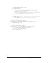
124 creating simple visual components in actionscript in this example, you first define the mycomp namespace to specify the location of your custom component. You then reference the component as an mxml tag by using the namespace prefix. You can specify any inherited properties of the superclass in ...
Page 125
Adding properties and methods to a component 125 adding properties and methods to a component to make your custom components reusable, you design them so that users can pass information to them. This section describes how to add public properties and methods to your components. It also describes how...
Page 126
126 creating simple visual components in actionscript return _prop1; } public function set prop1(value:number):void { // typically sets the private variable to the argument. _prop1=value; // define any other logic, such as dispatching an event. } } you can define and initialize a private variable, a...
Page 127
Adding properties and methods to a component 127 defining public properties as variables in the following example, you use the control+i key combination to extend the textarea control to let the user increase the font size by one point, or use the control+m key combination to decrease the font size ...
Page 128
128 creating simple visual components in actionscript } break; // was ctrl-m pressed? Case 77 : if (currentfontsize > minfontsize) { currentfontsize = currentfontsize - 1; setstyle('fontsize', currentfontsize); } break; default : break; } } } } } notice that the call to the getstyle() method is in t...
Page 129
Adding properties and methods to a component 129 the following example code defines a component named textareafontcontrolgetset that replaces the public property definition for the maxfontsize property shown in “defining public properties as variables” on page 127 : package mycomponents { // as/myco...
Page 130
130 creating simple visual components in actionscript case 73 : if (currentfontsize currentfontsize = currentfontsize + 1; setstyle('fontsize', currentfontsize); } break; // was ctrl-m pressed? Case 77 : if (currentfontsize > minfontsize) { currentfontsize = currentfontsize - 1; setstyle('fontsize',...
Page 131
Adding properties and methods to a component 131 you can use the [defaultproperty] metadata tag in your actionscript component to define a single default property, as the following example shows: package mycomponents { // as/mycomponents/textareadefaultprop.As import mx.Controls.Textarea; // define ...
Page 132
132 creating simple visual components in actionscript the one place where flex prohibits the use of a default property is when you use the actionscript class as the root tag of an mxml component. In this situation, you must use child tags to define the property, as the following example shows: xmlns...
Page 133
Adding properties and methods to a component 133 for example, in the section “defining public properties in actionscript” on page 125 , you created a class with the public property maxfontsize . You can use the maxfontsize property as the destination of a binding expression, as the following example...
Page 134
134 creating simple visual components in actionscript the following example modifies the component in the section “defining public properties in actionscript” on page 125 to make the maxfontsize and minfontsize properties usable as the source for data bindings: // define public properties for tracki...
Page 135
Adding properties and methods to a component 135 when you define a property by using getter and setter methods so that the property is usable as the source for data binding, you include the [bindable] metadata tag before the getter method, and optionally include the name of the event dispatched by t...
Page 136
136 creating simple visual components in actionscript // keydown event handler. Private function mykeydown(eventobj:keyboardevent):void { // was ctrl key pressed? If (eventobj.Ctrlkey) { switch (eventobj.Keycode) { // was ctrl-i pressed? Case 73 : if (currentfontsize currentfontsize = currentfontsiz...
Page 137
Adding properties and methods to a component 137 defining a method override you can override a method of a base class in your actionscript component. To override the method, you add a method with the same signature to your class, and prefix it with the override keyword. The following example overrid...
Page 138
138 creating simple visual components in actionscript the following example uses this component in an application: xmlns:mycomp="mycomponents.*"> import mx.Controls.Button; public function addbutton():void { var mybutton:button = new button(); mybutton.Label = "new button"; myhbox.Addchild(mybutton)...
Page 139
Adding properties and methods to a component 139 initializing inherited properties with tag attributes in mxml in an mxml component, you can initialize the value of any inherited public, writable property by defining a child tag of the mxml component with an id property that matches the name of the ...
Page 140
140 creating simple visual components in actionscript you can use your custom component in the following flex application: xmlns:mycomps="mycomponents.*"> xmlns:mycomps="mycomponents.*"> if the value of the id property of a textinput control does not match an inherited property name, flex creates a ...
Page 141
Defining events in actionscript components 141 custom components that extend existing flex classes inherit all the events of the superclass. If you extend the button class to create the mybutton class, you can use the events inherited from the button class, such as mouseover or creationcomplete , as...
Page 142
142 creating simple visual components in actionscript your custom component can also define event listeners within the component itself to handle the events internally. For example, “defining public properties as variables” on page 127 defined event listeners for the keydown and creationcomplete eve...
Page 143
Defining events in actionscript components 143 you might define some custom events that are used internally by your component, and are not intended to be recognized by the other components. For example, the following component defines a custom event, dispatches it, and handles it all within the comp...
Page 144
144 creating simple visual components in actionscript if you do not identify an event in the class file with the [event] metadata tag, the compiler generates an error when an mxml component attempts to register a listener for that event. Any component can register an event listener for the event in ...
Page 145
Applying styles to custom components 145 the following actionscript class file sets the color and bordercolor styles of the bluebutton control: package mycomponents { // as/mycomponents/bluebutton.As import mx.Controls.Button; public class bluebutton extends button { public function bluebutton() { s...
Page 146
146 creating simple visual components in actionscript in addition to setting the color property, you can set the font face, font size, and other style properties. For more information on the available style properties, see flex 2 developer’s guide. You can also define new style properties for your c...
Page 147
147 1 0 chapter 10 creating advanced visual components in actionscript this topic describes the details of creating advanced visual components for use in adobe flex applications. This topic assumes that you are familiar with creating simple actionscript components as described in chapter 9, “creatin...
Page 148
148 creating advanced visual components in actionscript you usually create a component as a subclass of an existing class. For example, to create a component that is based on the button control, you create a subclass of the mx.Controls.Button class. To make your own component, you create a subclass ...
Page 149
About creating advanced components 149 component users do not call these methods directly; flex calls them as part of the initialization process of creating a component, or when other method calls occur. For more information, see “about the component instantiation life cycle” on page 150 . About the...
Page 150
150 creating advanced visual components in actionscript the following table describes the invalidation methods: when a component calls an invalidation method, it signals to flex that the component must be updated. When multiple components call invalidation methods, flex coordinates updates so that t...
Page 151
About creating advanced components 151 the following example creates a button control in actionscript and adds it to a container: // create a box container. Var boxcontainer:box = new box(); // configure the box container. // create a button control. Var b:button = new button() // configure the butt...
Page 152
152 creating advanced visual components in actionscript f. Dispatches the initialize event on the component. At this time, all of the component’s children are initialized, but the component was not sized or processed for layout. You can use this event to perform additional processing of the componen...
Page 153
About creating advanced components 153 you can remove a component from a container by using the removechild() method. If there are no references to the component, it is eventually deleted from memory by the garbage collection mechanism of adobe flash player 9. About the steps for creating a componen...
Page 154
154 creating advanced visual components in actionscript for example, you can implement a custom button control that uses a new mechanism for defining its default size. In that case, you only need to override the measure() method. For an example, see “implementing the measure() method” on page 162 . ...
Page 155
Implementing the component 155 the following table lists the main interfaces implemented by flex components: implementing the component when you create a custom component in actionscript, you have to override the methods of the uicomponent class. This section describes how to implement the following...
Page 156
156 creating advanced visual components in actionscript ■ “basic component structure” on page 156 ■ “implementing the constructor” on page 157 ■ “implementing the createchildren() method” on page 157 ■ “implementing the commitproperties() method” on page 158 ■ “implementing the measure() method” on ...
Page 157
Implementing the component 157 implementing the constructor your actionscript class should define a public constructor method for a class that is a subclass of the uicomponent class, or a subclass of any child of the uicomponent class. The constructor has the following characteristics: ■ no return t...
Page 158
158 creating advanced visual components in actionscript // call the createchildren() method of the superclass. Super.Createchildren(); // test for the existence of the children before creating them. // this is optional, but do this so a subclass can create a different // child. If (!Text_mc) { text_...
Page 159
Implementing the component 159 calls to the commitproperties() method occur before calls to the measure() method. This lets you set property values that the measure() method might use. The typical pattern that you use for defining component properties is to define the properties by using getter and ...
Page 160
160 creating advanced visual components in actionscript changing the alignment of text in a control does not necessarily change the control’s size. However, if it does, include a call to the invalidatesize() method to trigger the measure() method. The main advantages of using the commitproperties() ...
Page 161
Implementing the component 161 btextchanged = true; invalidateproperties(); // changing the text causes the control to recalculate its default size. Invalidatesize(); invalidatedisplaylist(); } // define a private variable for the aligntext property. Private var _aligntext:string = "right"; private ...
Page 162
162 creating advanced visual components in actionscript } } implementing the measure() method the measure() method sets the default component size, in pixels, and optionally sets the component’s default minimum size. Flex schedules a call to the measure() method when a call to the invalidatesize() m...
Page 163
Implementing the component 163 component users can also override the default size settings in an application by using the component in the following ways: ■ setting the explicitheight and exlicitwidth properties ■ setting the width and height properties ■ setting the percentheight and percentwidth p...
Page 164
164 creating advanced visual components in actionscript you can override the default size settings in an application, as the following example shows: xmlns:mycomp="mycomponents.*" > xmlns:mycomp="mycomponents.*" > in this example, you specify that the width of the button is 50% of the width of the v...
Page 165
Implementing the component 165 in the following example, you override the measure() method of the textarea control so that it examines the text passed to the control, and calculates the default size of the textarea control to display the entire text string in a single line. Package mycomponents { //...
Page 166
166 creating advanced visual components in actionscript implementing the layoutchrome() method the container class, and some subclasses of the container class, use the layoutchrome() method to define the border area around the container. Flex schedules a call to the layoutchrome() method when a call...
Page 167
Implementing the component 167 a component does not appear on the screen until its updatedisplaylist() method gets called. Flex schedules a call to the updatedisplaylist() method when a call to the invalidatedisplaylist() method occurs. The updatedisplaylist() method executes during the next render ...
Page 168
168 creating advanced visual components in actionscript the properties have the following values: unscaledwidth specifies the width of the component, in pixels, in the component’s coordinates, regardless of the value of the scalex property of the component. This is the width of the component as dete...
Page 169
Implementing the component 169 // of the vbox. Var yofcomp:number = height-vm.Bottom; // temp variable for a container child. Var obj:uicomponent; for (var i:int = 0; i { // get the first container child. Obj = uicomponent(getchildat(i)); // determine the y coordinate of the child. Yofcomp = yofcomp...
Page 170
170 creating advanced visual components in actionscript the following application uses this component: xmlns:mycomp="mycomponents.*" > xmlns:mycomp="mycomponents.*" > drawing graphics in your component every flex component is a subclass of the flash sprite class, and, therefore, inherits the sprite....
Page 171
Adding version numbers 171 when you create a component, you can include actionscript that enables the component and a screen reader for audio communication. When developers use your component to build an application in flash, they use the accessibility panel to configure each component instance. Fla...
Page 172
172 creating advanced visual components in actionscript best practices when designing a component use the following practices when you design a component: ■ keep the file size as small as possible. ■ make your component as reusable as possible by generalizing functionality. ■ use the border class ra...
Page 173
Example: creating a composite component 173 example: composite component this section uses an example component, called modaltext and defined in the file modaltext.As, that combines a button control and a textarea control. You use the button control to enable or disable text input in the textarea co...
Page 174
174 creating advanced visual components in actionscript however, if a child component dispatches an event, and you want that opportunity to handle the event outside of the component, you must add logic to your custom component to propagate the event. Notice that the event listener for the change eve...
Page 175
Example: creating a composite component 175 ■ you can use both the textplacement property or the text property as the source for a data binding expression. ■ you can optionally use skins for the up, down, and over states of the button control. The following is an example mxml file that uses the moda...
Page 176
176 creating advanced visual components in actionscript the following example shows the modaltext.As file that defines this control: package mycomponents { // import all necessary classes. Import mx.Core.Uicomponent; import mx.Controls.Button; import mx.Controls.Textarea; import flash.Events.Event; ...
Page 177
Example: creating a composite component 177 // different child instead. Override protected function createchildren():void { super.Createchildren(); // create and initialize the textarea control. If (!Text_mc) { text_mc = new textarea(); text_mc.Explicitwidth = 80; text_mc.Editable = false; text_mc.T...
Page 178
178 creating advanced visual components in actionscript var buttonwidth:number = mode_mc.Getexplicitormeasuredwidth(); var buttonheight:number = mode_mc.Getexplicitormeasuredheight(); // the default and minimum width are the measuredwidth // of the textarea control plus the measuredwidth // of the b...
Page 179
Example: creating a composite component 179 if (textplacement == "left") { text_mc.Move(4, 4); mode_mc.Move(4 + textwidth + 5, 4); } else { mode_mc.Move(4, 4); text_mc.Move(4 + buttonwidth + 5, 4); } // draw a simple border around the child components. Graphics.Linestyle(1, 0x000000, 1.0); graphics....
Page 180
180 creating advanced visual components in actionscript private function handlechangeevent(eventobj:event):void { dispatchevent(new event("change")); } // handle events that are dispatched by the children. Private function handleclickevent(eventobj:event):void { text_mc.Editable = !Text_mc.Editable;...
Page 181
Troubleshooting 181 in some cases, helper classes are not ready by the time your component requires them. Flex adds classes to the application in the order that they must be initialized (base classes, and then child classes). However, if you have a static method that gets called as part of the initi...
Page 182
182 creating advanced visual components in actionscript.
Page 183
183 1 1 chapter 11 creating custom style properties styles are useful for defining the look and feel of your adobe flex applications, including letting users set component skins. You can use them to change the appearance of a single component, or apply them across all components. This topic describe...
Page 184
184 creating custom style properties about inheritance in cascading style sheets when you implement a style property in an actionscript component, that property is automatically inherited by any subclasses of your class, just as methods and properties are inherited. This type of inheritance is calle...
Page 185
About styles 185 setting styles using mxml tag attributes component users can use mxml tag attributes to set a style property on a component. For example, the following code creates a textarea control, then sets the backgroundcolor style of the component to blue (0x0000ff): setting styles using the ...
Page 186
186 creating custom style properties about overriding the stylechanged() method when a user sets a style on a component, flex calls the component’s stylechanged() method, passing to it the name of the style being set. When you create a custom component, you can override the uicomponent.Stylechanged(...
Page 187
Example: creating style properties 187 typically, you use a flag to indicate that a style changed. In the updatedisplaylist() method, you check the flag and update the component based on the new style setting, as the following example shows: override protected function updatedisplaylist(unscaledwidt...
Page 188
188 creating custom style properties this gradient is defined by two colors that you set by using a new style property called fillcolors . The fillcolors style takes an array of two colors that component users can set. The styledrectangle.As class defines default colors for the fillcolors style, but...
Page 189
Example: creating style properties 189 defining a style property you define a style property for a component in the class definition. To define a new style property: 1. Insert the [style] metadata tag that defines the style before the class definition. You insert the [style] metadata tag before the ...
Page 190
190 creating custom style properties the following code example defines the styledrectangle component and the fillcolors style: package mycomponents { // skinstyle/mycomponents/styledrectangle.As import mx.Core.Uicomponent; import mx.Styles.Cssstyledeclaration; import mx.Styles.Stylemanager; import ...
Page 191
Example: creating style properties 191 // define the variable to hold the current gradient fill colors. Private var fillcolorsdata:array; private var bfillcolorschanged:boolean = true; // define variables for additional controls on the fill. // you can create style properties for these as well. Priv...
Page 192
192 creating custom style properties setting default style values one of the issues that you have to decide when you create a style property for your component is how to set its default value. Setting a default value for a style property is not as simple as calling the setstyle () method in the comp...
Page 193
Example: creating style properties 193 if you include the tag, the tag creates the default style definition, as the following example shows: xmlns:mycomp="mycomponents.*"> styledrectangle {fillcolors: #ff00ff, #00ffff} xmlns:mycomp="mycomponents.*"> styledrectangle {fillcolors: #ff00ff, #00ffff} def...
Page 194
194 creating custom style properties.
Page 195
195 1 2 chapter 12 creating template components one way to create reusable components is to define them as template components. A template component defines properties with a general data type that lets the component user specify an object of a concrete data type when using the component. By using a...
Page 196
196 creating template components the following example shows an application that uses a template component called mytemplatecomponent: xmlns:mycomp="mycomponents.*" height="700" width="700"> paddingright="10" paddingleft="10"> xmlns:mycomp="mycomponents.*" height="700" width="700"> paddingright="10"...
Page 197
Implementing a template component 197 the implementation of the toprow and bottomrow properties lets you specify any flex component as a value, as the following example shows: xmlns:mycomp="mycomponents.*" height="700" width="700"> paddingright="10" paddingleft="10"> xmlns:mycomp="mycomponents.*" he...
Page 198
198 creating template components the following code shows the implementation of mytemplatecomponent: initialize="init();"> import mx.Containers.Hbox; import mx.Core.Uicomponent; // define a property for the top component. Public var toprow:uicomponent; // define an array of properties for a row of c...
Page 199
Implementing a template component 199 using ideferredinstance in a template component deferred creation is a feature of flex where flex containers create only the controls that initially appear to the user. Flex then creates the container’s other descendants if the user navigates to them. For more i...
Page 200
200 creating template components the following example shows an alternative implementation for the mytemplatecomponent component shown in the section “about template components” on page 195 , named mytemplatecomponentdeferred.Mxml, by defining the toprow and bottomrow properties to be of type idefer...
Page 201
Implementing a template component 201 in mxml, when the compiler encounters a value declaration for a property of type ideferredinstance, instead of generating code to construct and assign the value to the property, the compiler generates code to construct and assign an ideferredinstance implementat...
Page 202
202 creating template components defining an array of template properties you can define an array of template properties, as the following example shows: // define an array of deferred properties for a row of components. // do not restrict the type of the component. [arrayelementtype("mx.Core.Idefer...
Page 203
Implementing a template component 203 in the second example, you can only assign values of type mx.Controls.Button to it. Each array element is created when the application loads. The following template component shows an alternative implementatin of the mytemplatecomponent that restricts the type o...
Page 204
204 creating template components.
Page 205
205 4 part 4 creating nonvisual flex components this part describes how to create formatter, validator, and effect components for adobe flex. The following topics are included: chapter 13: creating custom formatters . . . . . . . . . . . . . . . . . . . 207 chapter 14: creating custom validators . ....
Page 207
207 1 3 chapter 13 creating custom formatters adobe flex includes several predefined formatters that you can use in your applications to format data. You also might have to extend the functionality of these predefined formatters, or create formatters for your specific application needs. This topic d...
Page 208
208 creating custom formatters creating a custom formatter you create a custom formatter by creating a class that extends the mx.Formatters.Formatter base class, or by creating a class that extends one of the standard formatter classes, which all extend mx.Formatters.Formatter. The following example...
Page 209
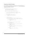
Creating a custom formatter 209 creating a simple formatter this example defines a simple formatter class that converts any string to all uppercase or all lowercase letters depending on the value passed to the formatstring property. By default, the formatter converts a string to all uppercase. Packa...
Page 210
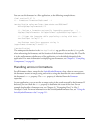
210 creating custom formatters you can use this formatter in a flex application, as the following example shows: xmlns:mycomp="myformatters.*"> {upperformat.Format(myti.Text)}" /> xmlns:mycomp="myformatters.*"> {upperformat.Format(myti.Text)}" /> the namespace declaration in the tag specifies to use...
Page 211
Using the switchsymbolformatter class 211 using the switchsymbolformatter class you can use the switchsymbolformatter utility class when you create custom formatters. You use this class to replace placeholder characters in one string with numbers from a second string. For example, you specify the fo...
Page 212
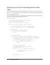
212 creating custom formatters handling errors with the switchsymbolformatter class unlike other formatters, the switchsymbolformatter class does not write its error messages into an error property. Instead, it is your responsibility to test for error conditions and return an error message if approp...
Page 213
Using the switchsymbolformatter class 213 error="invalid format string"; return "" } // if the formatstring and value are valid, format the number. Var dataformatter:switchsymbolformatter = new switchsymbolformatter(); return dataformatter.Formatvalue( formatstring, value ); } } } the following exam...
Page 214
214 creating custom formatters extending a formatter class you can extend the formatter class to create a custom formatter, or any formatter class. This section shows an example that extends the zipcodeformatter class by allowing an extra format pattern: "#####*####". In this example, if the user om...
Page 215
Extending a formatter class 215 // if the formatstring is anything other than '#####*####, // call super and validate and format as usual using // the base zipcodeformatter. Return super.Format(value); } } } notice that the extendedzipcodeformatter class did not have to define a formatstring propert...
Page 216
216 creating custom formatters.
Page 217
217 1 4 chapter 14 creating custom validators data validators let you validate the data in an object. Adobe flex supplies a number of standard validators that you can use in your application, however, you can also define custom validators for your specific application needs. This topic describes how...
Page 218
218 creating custom validators the following image shows the class hierarchy for validators: about overriding the dovalidation() method your custom validator class must contain an override of the protected validator.Dovalidation() method that takes a single argument, value, of type object, and retur...
Page 219
Example: creating a simple validator 219 subfield a string that specifies the name of the subfield associated with the validationresult object. In your override of the dovalidation() method, you can define an empty array and populate it with validationresult objects as your validator encounters erro...
Page 220
220 creating custom validators this validator extends the validator base class, as the following example shows: package myvalidators { import mx.Validators.Validator; import mx.Validators.Validationresult; public class agevalidator extends validator { // define array for the return value of dovalida...
Page 221
Example: creating a simple validator 221 } return results; } } } this example first defines a public constructor that calls super() to invoke the constructor of its base class. The base class can perform the check to ensure that data was entered into a required field, if you set the required propert...
Page 222
222 creating custom validators example: validating multiple fields a validator can validate more than one field at a time. For example, you could create a custom validator called namevalidator to validate three input controls that represent a person’s first, middle, and last names. To create a valid...
Page 223
Example: validating multiple fields 223 you can implement the namevalidator class, as the following example shows: package myvalidators { import mx.Validators.Validator; import mx.Validators.Validationresult; public class namevalidator extends validator { // define array for the return value of dova...
Page 224
224 creating custom validators return results; } } } in this example, because you are using a single validator to validate three subfields of the object passed to the validator, you include the optional second argument to the constructor for the validationresult class to specify the subfield that ca...
Page 225
Example: validating multiple fields 225 the dovalidation() method returns a validation error as soon as it detects the first validation error. You can modify dovalidation() so that it examines all of the input fields before returning an error message, as the following example shows. This custom vali...
Page 226
226 creating custom validators } return results; } } } notice that you remove the return statement from the body of the if statements so that the method contains only a single return statemen. This modification allows you to detect three different validation errors at once..
Page 227
227 1 5 chapter 15 creating effects behaviors let you add animation and motion to your application when some user or programmatic action occurs, where a behavior is a combination of a trigger paired with an effect. A trigger is an action, such as a mouse click on a component, a component getting foc...
Page 228
228 creating effects about creating a custom effect flex implements effects by using an architecture in which each effect is represented by two classes: a factory class and an instance class. Therefore, to implement a custom effect, you create two classes: the factory class and the instance class. Y...
Page 229
About creating a custom effect 229 by convention, the name of a factory class is the name of the effect, such as zoom or fade. Instance class the instance class implements the effect logic. When an effect trigger occurs, or when you call the play() method to invoke an effect, the factory class creat...
Page 230
230 creating effects the following table lists the methods and properties that you define in a factory class: factory method/property description constructor (required) the class constructor. You typically call the super() method to invoke the superclass constructor to initialize the inherited items...
Page 231
About creating a custom effect 231 the following table lists the methods and properties that you define in an instance class: instance method/property description constructor (required) the class constructor. You typically call the super() method to invoke the superclass constructor to initialize th...
Page 232
232 creating effects example: defining a simple effect to define a simple custom effect, you create a factory class from the effect base class, and the instance class from the mx.Effects.Effectinstance class. The following example shows an effect class that uses a sound object to play an embedded mp...
Page 233
About creating a custom effect 233 to define your instance class, you create a subclass from the mx.Effects.Effectinstance class. In the class definition, you must define a constructor and play() methods, and you can optionally define an end() method to stop the effect. Package myeffects { // myeffe...
Page 234
234 creating effects to use your custom effect class in an mxml file, you insert a tag with the same name as the factory class in the mxml file. You reference the custom effect the same way that you reference a standard effect. The following example shows an application that uses the mysound effect:...
Page 235
About creating a custom effect 235 example: passing parameters to effects to make your effects more robust, you often design them to let the user pass parameters to them. The example in this section modifies the sound effect from the previous section to take a parameter that specifies the mp3 file t...
Page 236
236 creating effects notice that the getaffectedproperties() method still returns an empty array. That is because getaffectedproperties() returns the list of properties of the effect target that are modified by the effect, not the properties of the effect itself. In your instance class, you define a...
Page 237
About tween effects 237 you can now pass the url of an mp3 to the effect, as the following example shows: xmlns:mycomps="myeffects.*"> soundmp3="http://localhost:8100/flex/assets/sample.Mp3"/> xmlns:mycomps="myeffects.*"> soundmp3="http://localhost:8100/flex/assets/sample.Mp3"/> soundmp3="http://loc...
Page 238
238 creating effects when you define effects based on the tweeneffect class, you must override the tweeneffectinstance.Ontweenupdate () method, and optionally override the tweeneffectinstance.Ontweenend () method. This section describes how to create a tween effect. However, flex supplies the animat...
Page 239
About tween effects 239 in this example, the effect works by modifying the rotation property of the target component. Therefore, your override of the getaffectedproperties() method returns an array that containsa single element. You derive your instance class from the tweeneffectinstance class, and ...
Page 240
240 creating effects in this example, tween object invokes the ontweenupdate() callback method on a regular interval, passing it values between anglefrom and angleto . At the end of the effect, the tween object calls the ontweenupdate() callback method with a value of angleto . By invoking the ontwe...
Page 241
Writing an effect for a transition 241 flex uses the following rules to determine the start and end values of effect properties when you use the effect in a transition: 1. If the effect defines the values of any properties, it uses the properties in the transition, as the following example shows: bl...
Page 242
242 creating effects using the propertychanges property the effectinstance.Propertychanges property contains a propertychanges object. A propertychanges object contains the properties described in the following table: in the body of the effectinstance.Play() method, you can examine the information i...
Page 243
Writing an effect for a transition 243 5. Flex applies the destination view state to the application. 6. Flex dispatches the currentstatechange event. 7. Flex plays the effects defined in the transition. As part of playing the effect, flex invokes the factory class play() method, effect.Play() , to ...
Page 244
244 creating effects rotationtransinstance(inst).Angleto = angleto; } } } in the rotationtransinstance.As class, you modify the play() method to calculate the default values for the anglefrom and angleto properties. This method performs the following actions: 1. Determines whether the user set value...
Page 245
Writing an effect for a transition 245 // check whether angleto is set. If (isnan(angleto)) { // if not, look in propertychanges.End for a value. // otherwise, set it to 360. Angleto = (propertychanges.End["rotation"] != undefined) ? Propertychanges.End["rotation"] : 360; } // create a tween object....
Page 246
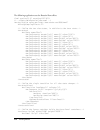
246 creating effects the following application uses the rotationtrans effect: xmlns:mycomp="myeffects.*"> xmlns:mycomp="myeffects.*">.
Page 247
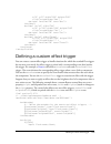
Defining a custom effect trigger 247 x="0" y="0" width="100" height="100" click="currentstate='one'" > x="0" y="110" width="100" height="100" click="currentstate='two'" > x="0" y="110" width="100" height="100" click="currentstate='two'" > x="110" y="0" width="200" height="210" click="currentstate=''...
Page 248
248 creating effects // define the private variable for the bright setting. Private var _bright:boolean = true; // define the setter to dispatch the events // corresponding to the effect triggers. Public function set bright(value:boolean):void { _bright = value; if (_bright) dispatchevent(new event(...
Page 249
Defining a custom effect trigger 249 the application in the following example uses the mybutton control. The darkeneffect and brighteneffect properties are set to the fadeout and fadein effects, respectively. The click event of a second button control toggles the mybutton control’s bright property a...
Page 250
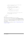
250 creating effects overriding the initeffect() method the effectinstance class defines the initeffect() method that you can override in your custom effect. This method has the following signature: public initeffect(event:event):void where event is the event object dispatched by the event that trig...
Page 251
251 index a accessibility, custom components 170 actionscript classpath 65 coding practices 25 custom components 21 defining components 121 distributing components as 69 application object, accessing 101 b behaviors in applications 227 defining custom effects 233 bindable metadata keyword 49 c class...
Page 252
252 index deploying components 23 dispatchevent() method 143 e effect metadata keyword 49 effects custom 228 custom effect trigger 247 defining custom 233 for transitions 240 tween effects 237 embed metadata keyword 49 enableaccessibility() method 171 event class, creating a subclass 38 event metada...
Page 253
Index 253 mxml components about 77 creating 78 reusable 91 n noncommittingchangeevent metadata keyword 49, 60 p package statement 25 performance, rsls 23, 68 postal codes, formatting 211 properties as getters and setters 30 as variables 30 commitproperties() method 159 getter and setters 128 getters...
Page 254
254 index.


